<
>
![]()
new ways of thinking, new connections
beyond brand
branding, graphic design and web development
It's an increasingly challenging, noisy, fragmented market environment. The task of getting your message across effectively is considerably more complex than just publishing a website or printed literature.
Successful brand and design is about thinking in new ways. Making new connections. A diagonal thought process that engages both logic and creativity; achieves goals and objectives as well as embracing emotional responses.
Sense Not Logic takes a 360º approach to the design process. We work from below ground, establishing strong roots to support firm growth.
It's not always reason that appeals to your customers or clients. It's about provoking their senses not logic... sometimes, something just feels right.
Brand
In its simplest form your brand can be thought of as the personality of your company, product or service(s). A valuable asset, it communicates what people can expect and, applied with consistency, can provide reassurance and familiarity.
If you don't have a brand we can work with you to develop it. The process involves creating a unique name and image with a constant theme. Branding aims to establish a significant and differentiated presence in the market that attracts and retains loyal customers.
If you already have a brand it will remain safe in our hands. We fully understand brand guardianship and alignment.
Create
Creating compelling content that communicates substance is essential. These are the messages you want your target market to hear, loud and clear, even if it is subtle! This stage informs the graphic approach.
It's about copy. Text content is perhaps the vital part of the chemistry. What needs to be said will inform the type of images, icons, typography, colours and space required.
The right kind of imagery is invaluable and where on the scale from informative to emotive it falls. It can be commissioned creative or editorial photography and illustration. Stock photography or your existing image library.
Design
Graphic design is the process of visual communication utilising type, space, image and colour.
Design puts your message first, combining your brand with your key proposition. There are many formats that enable you to engage and communicate with your customers generating a response, wider awareness and increased sales.
Whether you require stationery, a brochure, leaflet or catalogue, exhibition display graphics, an eCommerce or brochure website, app or any other type of promotion, they should all be carefully aligned with your messaging, goals and objectives... consistent across all delivery platforms and devices.
Cultivate
Having developed your brand, created compelling content and graphics you may think the job is done... it isn't. The structure has been put in place, but you need to cultivate for growth.
Your website must be ready, from the roots up, for Search Engine Optimisation. It should support your Online Reputation Management through Social Media. Your marketing strategy could collapse if you don't adopt the right approach. Whether that's Google Adword, Email or print led campaigns, good preparation adds credibility.
Continual monitoring, updating and adjustment are vital parts of a successful design and communication process.
4 vital elements
Sense Not Logic has all the skill and experience to support you through the whole process, delivering great looking, effective brand and graphic design solutions.
We provide brand design and development, logo design, creative and art direction, image creation, editing and sourcing, copy writing, graphic design, ePublishing, website and responsive web development. Contact us to discuss your requirements.
strategy led branding and design
award winning graphic solutions
creativity and logic aligned
portfolio
Over the years we have worked with start ups, small business, musicians and bands, museums, charitable organisations and large companies. Our client projects include DELL, Fujitsu, Fort James, Marks and Spencer, Liberty Mint/Manchester United, Eden Vale, Vale Royal Council (now Cheshire West and Chester), FS Walker Hughes/Chroma Airport Suite, Amor Group (now Lockheed Martin), The Lion Salt Works, BOSS Model Agency, Mark Radcliffe (BBC), Socotra Logistics UK, IGG Investments (igglu), E-Ryder AGD Ltd, BMC Exhibitions... and many more.
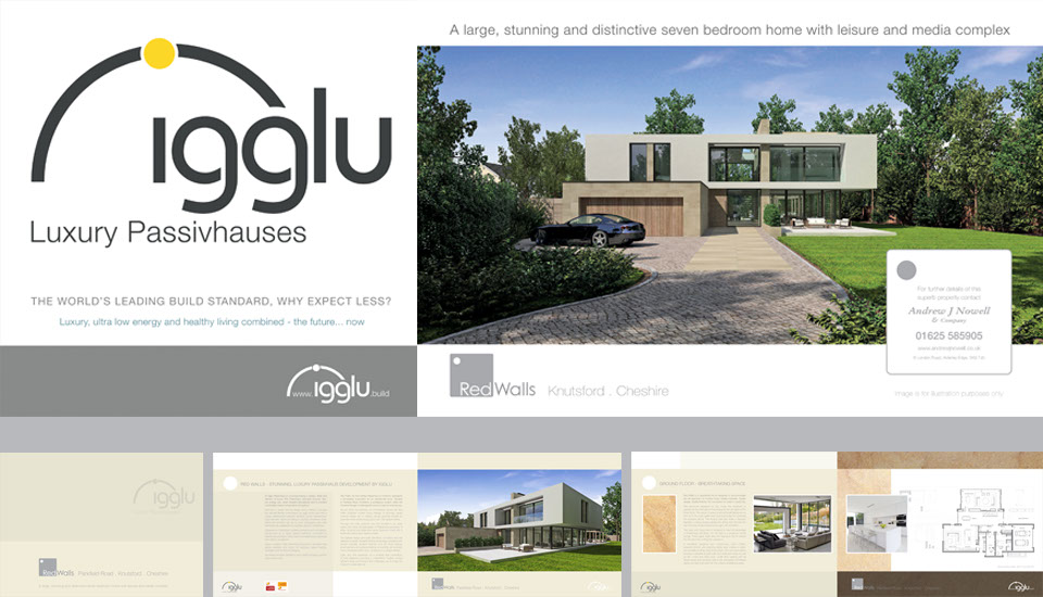

Client: IGG Investments
This project involved naming, brand development, site hoardings, brochure design, print and provision of a FlipBook for digital distribution. As an off-plan sale property, it was important to liaise closely with the architect and interior designer. It also entailed writing the copy, sourcing relevant stock imagery and location photography.
Ian Forde-Smith, Director, IGG Investments: "[The work has] been done to a very high standard and we are very pleased with the results."
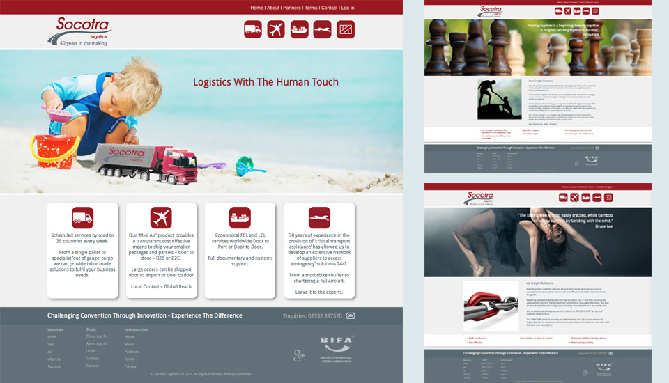
Client: Socotra Logistics UK Limited
The brief for Socotra's website was to develop a brand presence in the UK built on the well established French company. It involved working closely with the client to develop concepts that conveyed strong ethics, sourcing and editing images and building their brand messaging. From this the website was developed. Currently working on refining the site, setting the log in, toolbox and on line ordering up, we are also developing Google Adword, email campaigns and establishing the social media profile.
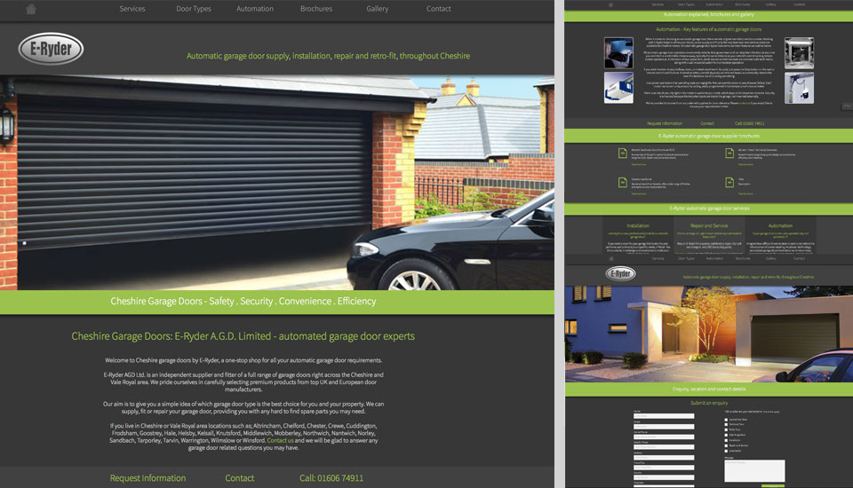
Client: E-Ryder AGD Ltd
Currently a work in progress, we have been engaged to update the brand feel and modernise the website, portraying key content and increasing usability across mobile devices. The site requires careful search engine optimisation as it currently has a favourable profile but is beginning to lose site visits.
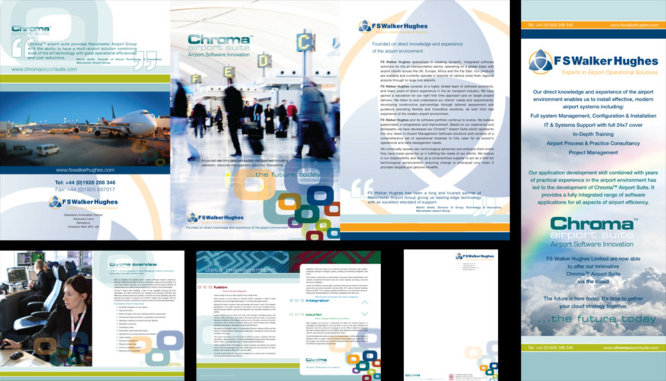
Client: FS Walker Hughes
The initial brief was to refresh the identity of FS Walker Hughes, then consider their array of software modules that resided under various names. It was a request that the look became colourful to stand out from existing industry 'standards'. We named and developed the Chroma Airport Suite brand. This involved a considerable amount of work across all delivery platforms, naming, brand development, website, printed literature, exhibition display design and looping video production for looping TV monitors on the exhibition stands. Amor Group retained the branding and naming when it purchased FS Walker Hughes. Lockheed Martin has since acquired Amor Group and itself retained the brand.
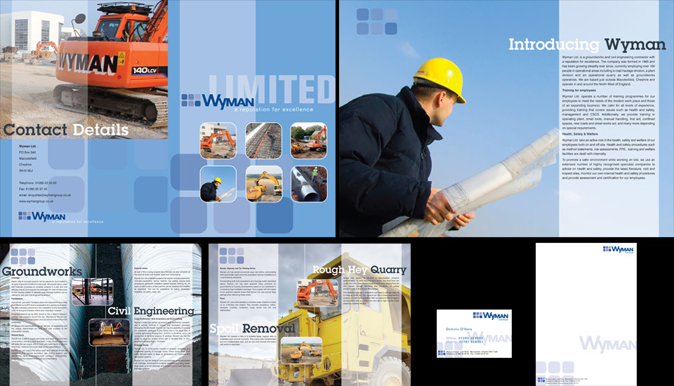
Client: Wyman Group Limited
Wyman required an identity or brand that covered the full range of their group services, from the quarry and ground works through to high quality, aspirational property developments in places such as Alderley Edge and Prestbury, Cheshire. An example of their property development can be seen on the next image. This in involved copy writing, working with their existing library images and sourcing relevant stock images.
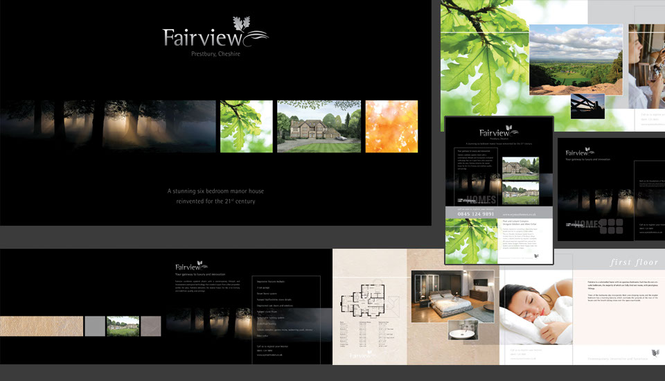
Client: Wyman Group Limited
The brochure and magazine advertisements were designed for one of Wyman's aspirational property developments in Prestbury, Cheshire. As an off plan property sale it was vital to communicate the quality and innovation inherit in the build and finish and the lifestyle the property imbued. It involved the design, copy writing and image sourcing. Working with CAD drawings to produce floor plans as well as keeping an eye on magazine publishing formats and deadlines.
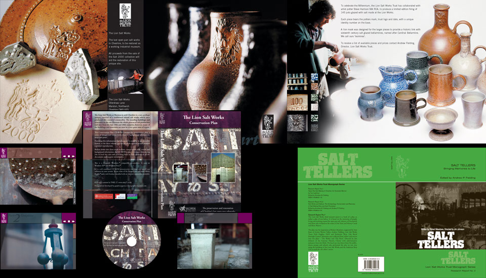
Client: The Lion Salt Works (Part of Cheshire County Council)
Working with the Lion Salt Works, over a number of years, necessitated a clear understanding of the museums raison d'etre, building a close relationship with the museum director. Commissioned art directed photography and sensitive design led to a North West Museums marketing award for the artist's commissioned Salt Glaze pottery brochure. A series of books on varying subjects were designed, set and printed. The pinnacle was designing and producing an interactive digital presentation securing a £7million Heritage Lottery Fund investment. This included a large image library and set of reference documents with walk through movies of the proposed museum development.
Client: CRJ Services Limited
The key target market for the green waste composting CRJ developed was local government. The brand needed to reflect the nature of its sustainable recycling proposition. We named and developed the 'back to the land' brochure, leaflet and website campaign to promote its key concept and credentials. The project included design, copy writing, stock image sourcing and location photography.
Client: DELL Corporation
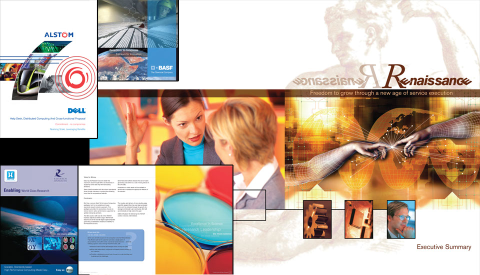
Working with DELL on their bid documentation involved developing a clear understanding of their business, proposition and building a close relationship with their bid groups. All of this work was done to incredibly tight deadlines. A bid submitted a minute passed the deadline would be excluded from the process. It included many elements; Executive Summary design and print, CD content and covers, binder covers and dividers, all achieved with careful consideration of the bid proposal clients. Presenting the 'Renaissance' bid for the Dell Corporation to Unilever in person Michael Dell commented: “All of our high level bids should be designed to this quality and standard.”
Client: ICL/Fujitsu
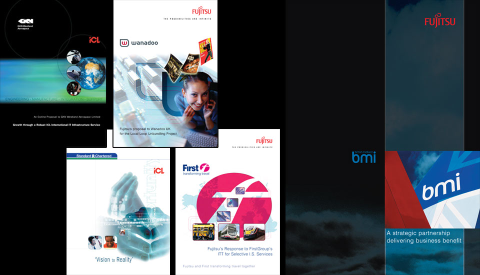
Working with ICL/Fujitsu on their bid documentation over a number of years involved developing a clear understanding of their business, proposition and building a close relationship with their bid groups. All of this work was done to incredibly tight deadlines. A bid submitted a minute passed the deadline would be excluded from the process. It included many elements; executive summary design and print, CD content and covers, binder covers and dividers, all achieved with careful consideration of the bid proposal clients.
Client: BMC Exhibitions
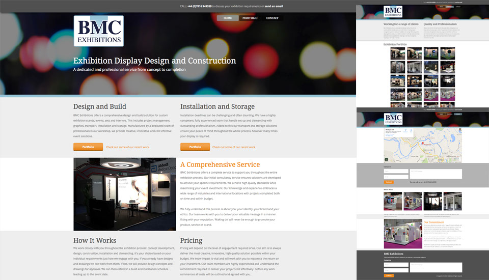
BMC have been working in a high pressure, high profile exhibition environment without building their own presence. Currently a work in progress the website has been the first step to changing that. The next step is to establish keywording for SEO.
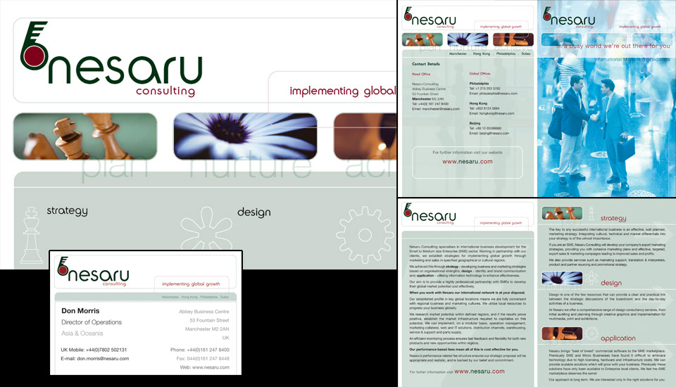
Client: Nesaru Consulting
At the time of engagement the company was known as Cactus Group. They felt the name was losing its uniqueness and relevance. They required a 'global' feel that representation their approach as a marketing consultancy. The project involved naming the company, logo design, key messaging, graphics, copy writing and sourcing appropriate stock imagery.
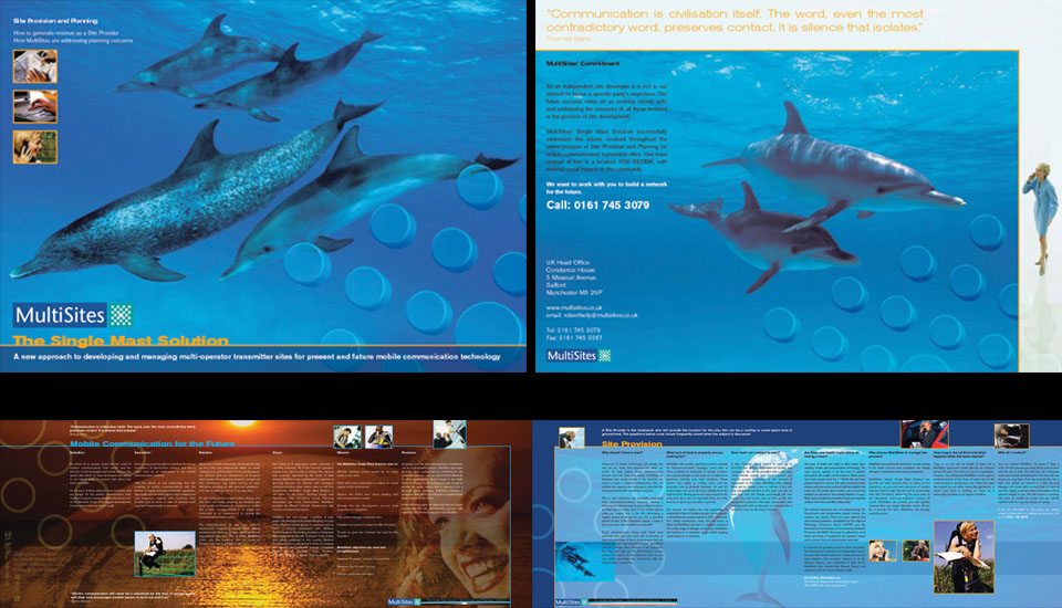
Client: MultiSites
Working with their existing identity, the brief was to develop a promotional brochure to encourage owners of potential site locations to rent them to MultiSites. This was a sensitive subject in many rural locations, so the messaging focussed on the practicality of their multi-operator system and the natural desire to communicate. This project involved concept development, copy writing, stock image and location photography, brochure design and print.
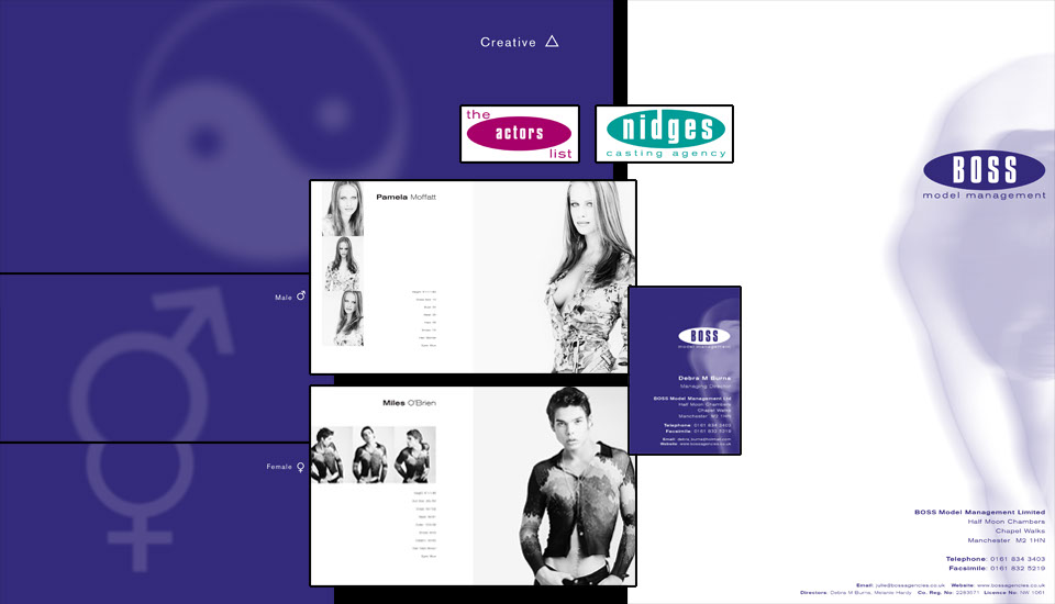
Client: BOSS Model Management
BOSS required a logo redesign that would incorporate the offshoots The Actors List and Nidges Casting Agency. The approach was minimal, focussing on the models themselves. Over a number of years this involved producing the logo, a light box sign for the office building projecting the name onto the pavement, metal name plaques, stationery and the model book designs.
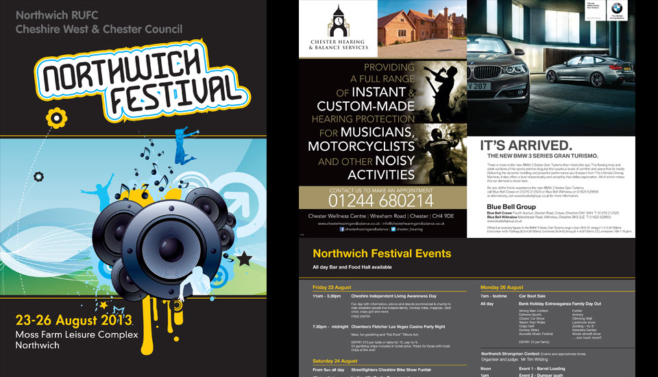
Client: Northwich RUFC and Cheshire West and Cheshire Council
Working within established brand and identity guidelines, design and produce final artwork for the festival programme, incorporating sponsor's advertising in a tasteful manner. The team were new to the whole process and needed support and guidance. The project also included the production of a small video of the event to help with future sponsorship promotion. This included shooting the footage, editing and providing the soundtrack. The video can be seen on the Northwich Festival 2015 website. Sadly we've not been involved with the website (or the programme this year).
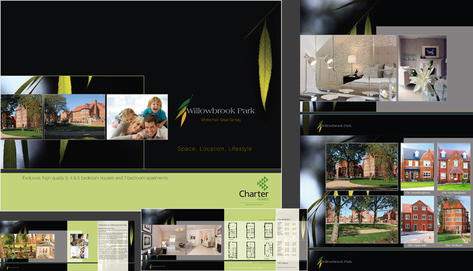
Client: Charter Homes
Design a development logo, promotional brochure and magazine advertising for a sizeable housing construction project in Warrington, Cheshire. This also involved copy writing, art direction of interior photography, sourcing stock imagery and location photography.
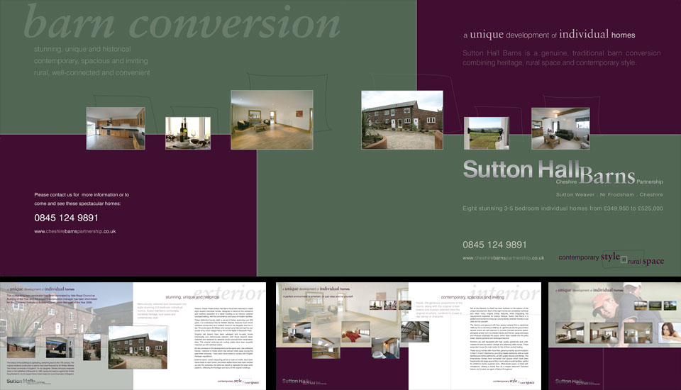
Client: Cheshire Barns Partnership
The brief was to reflect this subtle development set in the Cheshire countryside close to Frodsham. Sutton Hall itself dates back 4 centuries. The client felt it important to balance the location, convenience and contemporary conversion with a sense of history. The project involved brochure design, including copy writing, interior and exterior photography and stock image sourcing. We also produced site signage and magazine advertising.
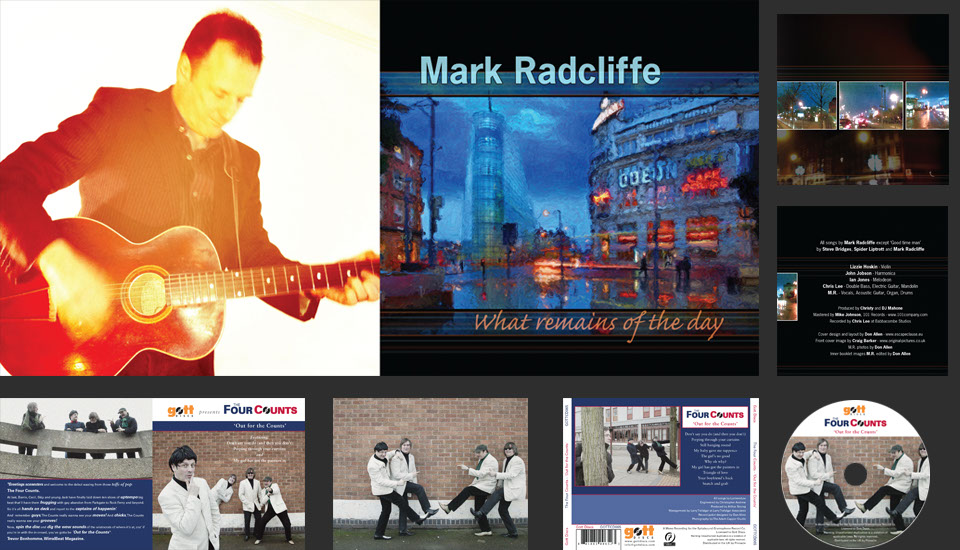
Client: Mark Radcliffe (BBC Radio presenter)
A touch of fun involved with these. The Four Counts was a release on Gott Discs. Creating a cover where the four band members, two sets of brothers, were only two people meant a fair amount of image editing. Mark's solo offers a more personal, reflective tone so the design focussed on the more sombre streets of Manchester. I've refrained from putting the CD covers from my association with Mark that lasted a good few years, The Family Mahone. Gone, but not forgotten it seems.
1 - 18
<
>
contact
The studio is based in the heart of Cheshire, so we are conveniently located for Warrington, Liverpool, Runcorn, the Wirral, Chester,
Nantwich, Stoke, Macclesfield and Manchester. We have clients throughout the North West of England and the UK, so please
don't hesitate to contact us if you feel you would like to discuss your requirements.
If you would like to talk to us, call Sense Not Logic on 07595 340062
Information submitted will not be passed on to any third party
© Sense Not Logic 2015


alternatively complete the form below or send an email
portfolio
contact


